Chapter 7 Custom Content
Custom content maintains and manages shortcuts, multi-level navigation, featured topics, custom interfaces, and application data sources. These primarily support portal management components (shortcuts, multi-level navigation, featured topics, custom pages, accessible systems, map components) along with headers/footers.
7.1 Shortcuts
Shortcut Data Source Configuration
This section explains how to add shortcut data sources, configure their properties, reference them in portals, and demonstrate their effects in the frontend display.
1. Access and Create Shortcut Data Sources
- Navigate to the Portal Management Backend.
- Select Custom Content → Shortcuts to open the Shortcut List page.
- Click "New Shortcut" to configure a new shortcut with basic information and link addresses.
2. Shortcut Configuration Parameters
| Parameter | Description |
|---|---|
| Name | Shortcut data source name, used to differentiate between multiple shortcut sources. |
| Content Permissions | Determines whether the shortcut can be used in anonymous portals. Anonymous portals are publicly accessible; regular portals require login. |
| Type | Specifies if the shortcut is for Plain Text or Image-Text display. |
| Content Mode | - Configuration Mode: Define shortcut name, link, and permissions. - Source Code Mode: Paste code directly for bulk configuration. |
| Maintainable Users | Assign specific users who can maintain this shortcut. If left empty, only the creator and portal administrators can modify it. |
Tip: At least one link address must be configured when creating a shortcut. The link title, remarks, and icon will be shown in the shortcut component. Clicking the title redirects users to the link address.
3. Link Address Configuration Actions
- Create: Click the "Create" button to add a new link row at the bottom.
- Edit: Click the "Edit" button to insert a new row after the current link.
- Delete: Click the "Delete" button to remove the selected link.
- Reorder: Hover over a row, then drag and drop to change its position.
You can view and modify existing shortcuts by clicking on any entry in the Shortcut List to open the Details Page.
4. Reference Shortcuts in the Portal
- Navigate to Portal Configuration → Edit Portal → Edit Page.
- Drag the Shortcut Component into the desired location on the page.
- Hover over the component, click "Content", and select a previously configured shortcut data source.
- Save the page and click Preview to view the effect.
Note:
- The Image-Text Shortcut Component supports image-text shortcut sources only.
- The Plain Text Shortcut Component supports plain text shortcut sources only.
7.2 Multi-level Navigation
Multi-level Navigation
This section explains how to add multi-level navigation data sources, reference configurations on the portal, and display the multi-level navigation effect.
1. Manage Multi-level Navigation Data
- Go to the portal management backend.
- Select Custom Content - Multi-level Navigation from the menu to enter the multi-level navigation list page, where you can maintain multi-level navigation data.
- Click Create to enter the multi-level navigation addition page.
- Configure basic information and link addresses.
- Set the navigation menu's remark field and access permissions. Users not listed cannot view this navigation or its sub-level menus.
- After enabling and saving the data synchronization feature, modifications are not allowed. Customizing components using this multi-level navigation data source will simultaneously modify other identical data sources and users.
Tips:
- When creating multi-level navigation, the link title and icon will display in the multi-level navigation component.
- The link address is optional; if left blank, clicking the link title will not redirect.
- Use the following buttons for link management:
- Add Sibling: Insert a new link at the same level after the current link.
- Add Child: Insert a new link as a child of the current link.
- Delete: Remove the current link and its child links.
- You can drag and sort link address rows at the same or different levels. Moving a main navigation moves its child navigations as well.
- Multi-level navigation supports source code mode, allowing direct copying and pasting of pre-configured multi-level navigation link addresses.
- In the navigation settings button on the right, configure the floating window content for this navigation menu to display in specific components.
2. Referencing Multi-level Navigation on the Portal
Multi-level Navigation Component
- Go to Portal Configuration > Edit Portal > Edit Page.
- Search for multi-level navigation, drag the multi-level navigation component into the page container.
- Select the newly added multi-level navigation data source.
- Configure component titles and other settings.
- Save the page.
Rendering Effect
The multi-level navigation component will display the navigation structure as configured.
Map Component Referencing Multi-level Navigation
- Go to Portal Configuration > Edit Portal > Edit Page.
- Select This System > Map Component, drag the map component into the page container.
- Select the newly added multi-level navigation data source.
- Save the page.
Rendering Effect
The map component will render based on the multi-level navigation data source.
Header Referencing Multi-level Navigation
- Go to Portal Configuration > Edit Portal > Edit Page.
- Select the header, click Settings.
- Choose the newly added multi-level navigation data source.
- Save the page.
Rendering Effect
The header will render with the multi-level navigation structure.
7.3 Recommended Topics
Recommended Topics
Recommended topics are images with link addresses. Their display ratio can be configured to fit different-sized sections on the page. This is typically used for recommended topic components.
This section explains how to add a recommended topic data source, reference and configure recommended topics on the portal, and display the rendering effect.
1. Add Recommended Topic Data Source
- Go to the portal management backend.
- Select the Custom Content - Recommended Topics menu.
- Click Create.
- Configure the recommended topic image, image link, and the applicable scenario ratio.
Tips:
- Check the Use Scenario button to enable the image to automatically adapt to different ratios based on the container size.
- Uncheck it to display the image at its original size without adapting to the container.
2. Add Recommended Topics on the Portal (Reference Data Source)
- Go to Portal Configuration > Edit Portal > Edit Page.
- Select This System > Portal Management.
- Drag the recommended topic component into the page container.
- Under the Content tab, select the newly added recommended topic data source (supports multiple selections).
Note:
- Featured topics are used for page display effects.
- After selecting multiple recommended topic images, the images will switch in a carousel manner on the page.
7.4 Custom Pages
Custom Page Data Sources
Custom page data sources are mainly used for custom page components. A custom page data source is a rich text box where users can fully customize the display content, which can be a paragraph of text, some images, or a mix of text and images.
This section explains how to configure custom pages and preview their effects.
1. Configure Custom Pages
- Enter the portal management backend.
- Select the Custom Content - Custom Pages menu.
- Go to the custom interface configuration page to set its basic properties and custom page content.
Custom Interface Configuration
- Custom Table Configuration
- Portal Configuration
Portal Usage Effects
-
Configure Hyperlink Images
- Edit and fill in the hyperlink address.
- Choose whether to open the link in the current window or a new window.
- Click Preview to view the preview effect.
-
Configure Inserting Local Images
- Insert local images as desired.
- Click Preview to view the preview effect.
-
Configure Inserting Source Code Images
- Copy the image's source code into the dialog box.
- Click OK to insert the image.
2. Reference Custom Page on the Portal
- Go to Portal Configuration > Edit Portal > Edit Page.
- Select This System > Portal Management.
- Drag the custom page component into the page container.
- Under the Content tab, select the newly added custom page data source.
- After configuration, the effect displayed on the portal will match the preview effect.
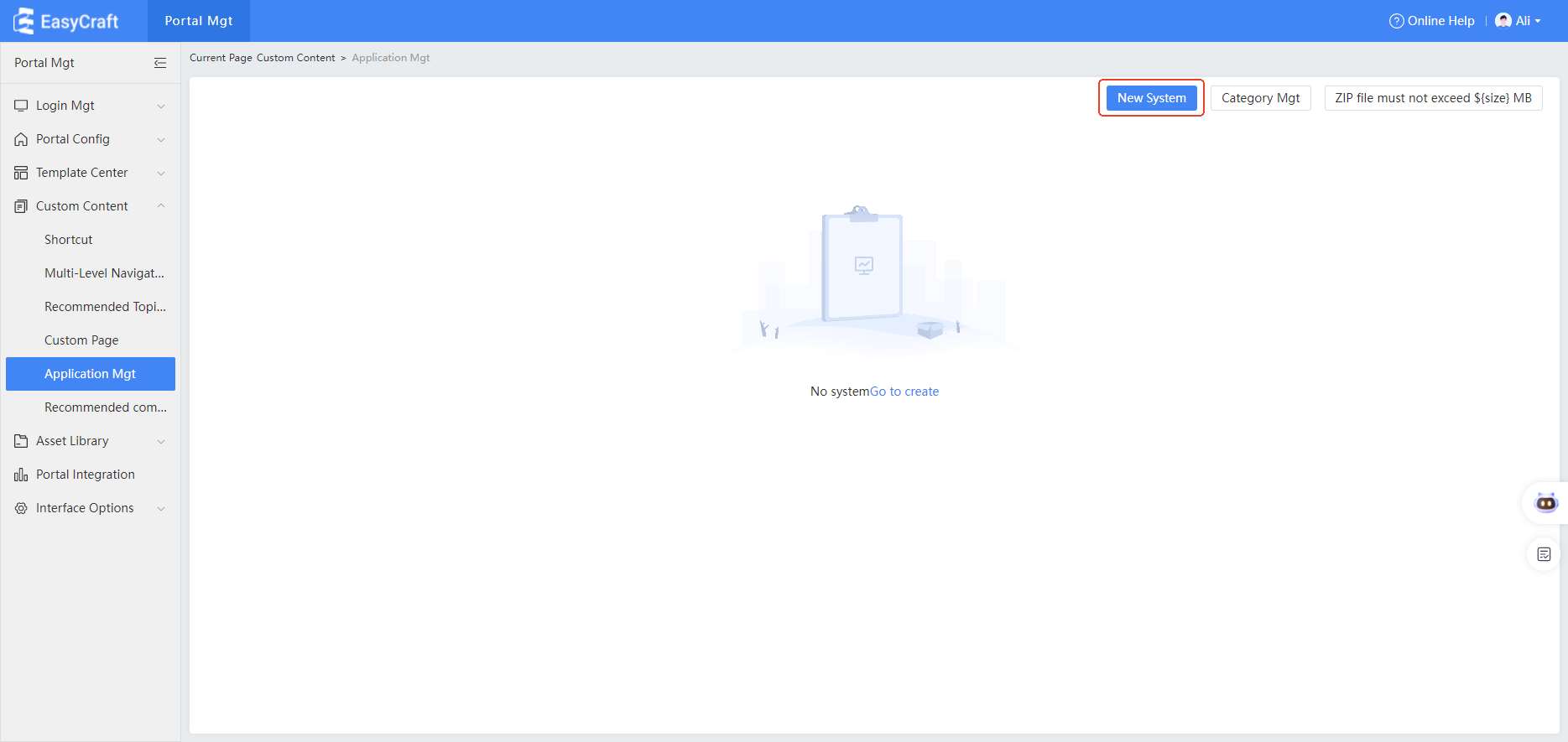
7.5 Application Management
Application Management in Portal Configuration
Under Portal Configuration - Custom Content, add an Application Management tab to display all systems passed from the unified authentication system. Users can also perform the Add System operation.
This section explains how to configure accessible systems and the user-side effects of using these systems.
1. Configure Application Management
-
Access the portal management backend, select the Custom Content - Accessible Systems menu, and click on Access Permissions.
- After configuring permissions, all accessible systems will use these permissions.
- Permission sources can be set to Local System Permissions or Third-party System Permissions.
- Selecting local system permissions will adopt the "Accessible Users" system permissions from System Settings.
- Third-party system permissions are provided by IDM for accessible users. When creating a new system, fill in the corresponding code for the third-party system.
-
Click Create New System.
-
In the new system pop-up window:
- Fill in the system name, link, select system category, input a description of the system, and change the icon.
- After saving, the new system will appear in the list.
- Note: System names must be unique.
- Click Categories Management to create new categories, edit, or delete existing ones.
- Category names must be unique.
2. Accessible System Portal Configuration Page and User-side Display
-
Enter the portal, edit the page, and drag the accessible system component into the container.
- Component location: Local System > Portal Management.
-
In the content area, select what the accessible system component displays on the user side.
- The selected content comes from data in Content Management.
-
After saving and publishing the portal, the user-side will display the accessible system effect.